
New York Jets Logo History: 1960 to Today
Posted by JerseyZenith on Oct 26th 2026
- "TITANS" in gold block italics with "THE" above and "OF NEW YORK" below, with a navy player figure.
- The table below runs from 1960–1962 to 2026.
- Photos show uniforms and equipment; standalone logo artwork is not reproduced.
This guide covers the New York Jets logo and helmet marks from the first design to 2026, mostly from Wikipedia and team news. It does not cover every minor change.
New York Jets logo history timeline
| Year | Change | Context |
|---|---|---|
| 1960–1962 | "TITANS" in gold block italics with "THE" above and "OF NEW YORK" below, with a navy player figure | Not on the uniform |
| 1963 | Jets: white oval secondary logo with "JETS" over outlined "NY" and a green football | Rename |
| 1963–1964 | Green jet silhouette with white "JETS" on the helmet, then a football-shaped decal | Helmet decal |
| 1965 | Helmet decal colors reversed on a green football shape | Matches the 1963 oval |
| 1978 | Angular italic "JETS" wordmark with a jet silhouette extending from the "J" | Solid green helmets |
| 1990 | Thin black outlines added to logo decals | Black facemasks |
| 1998 | Modified oval logo restored, with laces on the football | Parcells era |
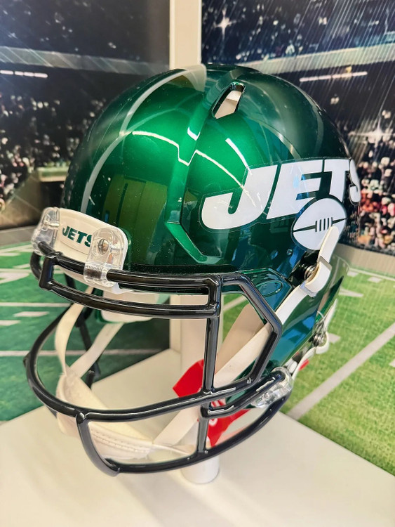
| 2019 | "Take Flight": football-shaped primary logo, "NEW YORK" above "JETS" | New wordmark |
| 2024 | Legacy Collection revises the 1978 wordmark | Tighter spacing, wider jet tail |
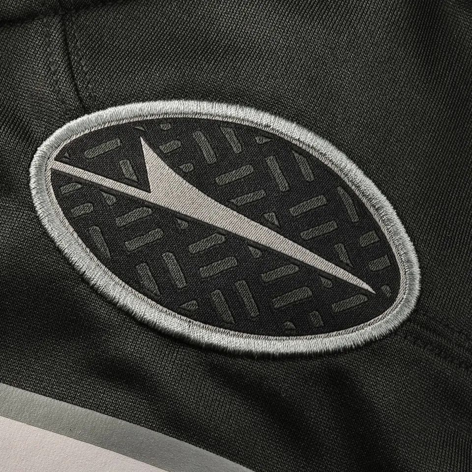
| 2025 | "Gotham City Football" Rivalries helmet with silver "JETS" logos on matte black | Rivalries debut |
| 2026 | "White Out" helmet with a green wordmark decal | Newest helmet |
This guide describes logos in words and tables. Standalone logo artwork is not reproduced.
1960 to 1977: Titans, then the oval
As the Titans of New York the team had a "TITANS" logo in gold block italics, not shown on its uniforms. The Jets name brought a white oval secondary logo in 1963, and a jet silhouette, then a football-shaped decal, went on the helmet in 1963 and 1964. The colors were reversed in 1965.
1978 to 2018: the jet wordmark and the return of the oval
In 1978 the Jets moved to solid green helmets with an angular italic "JETS" wordmark and a jet silhouette extending from the "J." Black outlines came in 1990, and in 1998 the team restored a modified oval logo on white helmets, with laces on the football.
2019 to now
The 2019 "Take Flight" redesign made the primary logo more football-shaped and dropped the "NY" outline. The 2024 Legacy Collection slightly revised the 1978 wordmark with tighter spacing, a wider jet tail and a streamlined nose. The 2025 Rivalries helmet used silver logos on matte black, and the 2026 White Out helmet uses the green wordmark.
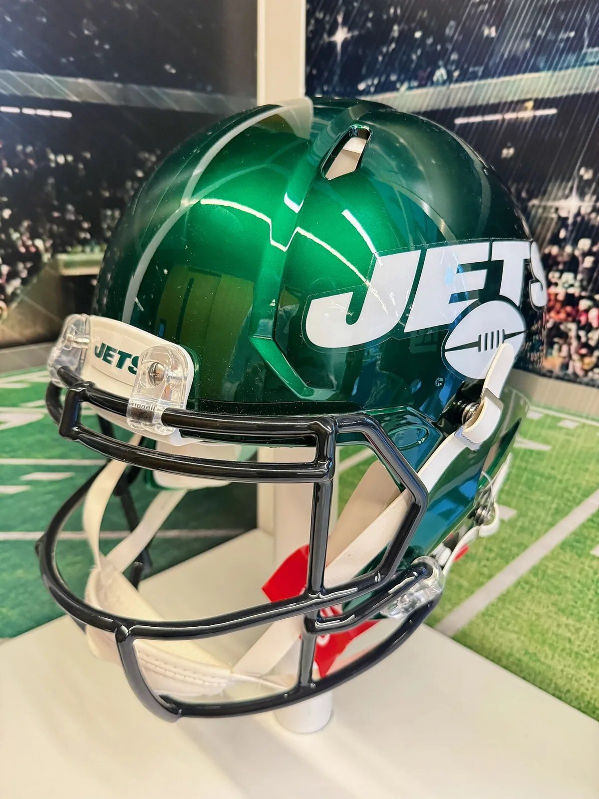
Jets helmet and logo placement
Helmets: navy blue (1960–1962), white with green stripes (1963–1977 and 1998–2018), solid green (1978–1997), emerald metallic (2019–2023), metallic green with white facemasks (2024 to now), plus the matte black, white "Classic" and 2026 White Out alternates.
Reading the Jets timeline: old logo, new logo
Fans search for the Jets logo, the Jets old logo and the Jets new logo, and this page answers all three. The newest entry is the last row of the table; earlier rows are older logos and wordmarks. A logo can change on the helmet, on the sleeves or on the chest at different times, so the same year can appear in more than one row. To date an older jersey, compare the product photo with the table: look at the wordmark, the sleeve mark and the facemask color. Where the sources we read disagree or give no year, the table leaves the year out rather than guess.
Logo changes and jersey changes
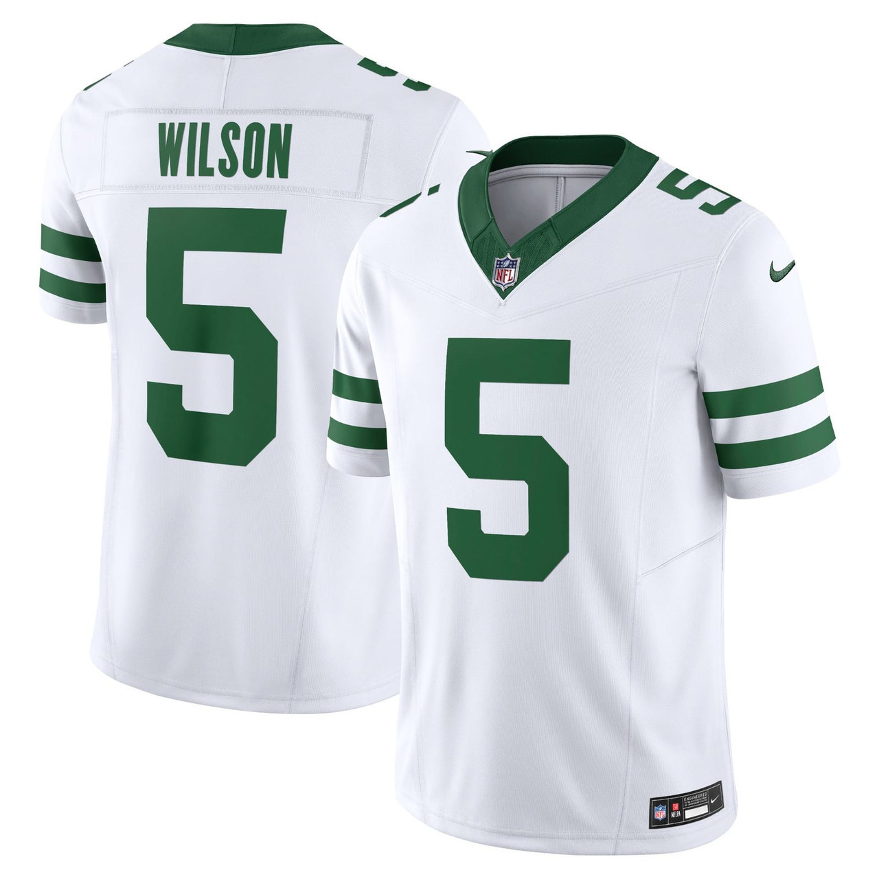
A logo and a jersey do not always change together. For the uniform side of the story, read the New York Jets uniform history and the New York Jets jerseys 2026 guide. For retired-player styles, see legends jerseys.
Old logo, new logo: which jersey to buy
If you like an older look, New York Jets throwback jerseys is the place to start. If you want what the team wears now, choose the current home or away jersey. Nike Game is the everyday tier and Limited adds sewn-on numbers; compare them in the Nike Game vs Limited vs Elite guide, and check the NFL jersey size chart. Men's, women's and youth sizes are available. Logo patches and decals vary by style, so look at the product photo before you order.
New York Jets Logo History FAQ
What is the Jets logo?
A jet-silhouette "JETS" wordmark on the helmet, based on the 1978 design.
What was the Jets logo before 1978?
A white oval with "JETS" over an "NY" and a football, and a jet or football helmet decal.
When did the Jets get a new logo?
2019 for the "Take Flight" redesign; the 1978 wordmark was revised in 2024.
What were the Titans of New York colors?
Navy blue and gold.